Font & Typography
Landour
ABCDEFGHIJKLMNOPQRSTUVWXYZ
abcdefghijklmnopqrstuvwxyz
0123456789-+!@#$%^&*()
2024
Reelm reimagines the movie review experience by addressing common usability issues found in current platforms. This project focuses on creating an uncluttered interface with intuitive navigation and well-organized content, demonstrating the principles of user-centered design and mobile-first development.
Identity & Concept
After analyzing common pain points in popular movie review apps like Letterboxd, IMDb, and Rotten Tomatoes, Reelm was created to make movie discovery simpler. The name combines "reel" (classic cinema) with a modern twist, reflecting our commitment to blending traditional movie appreciation with contemporary user experience.
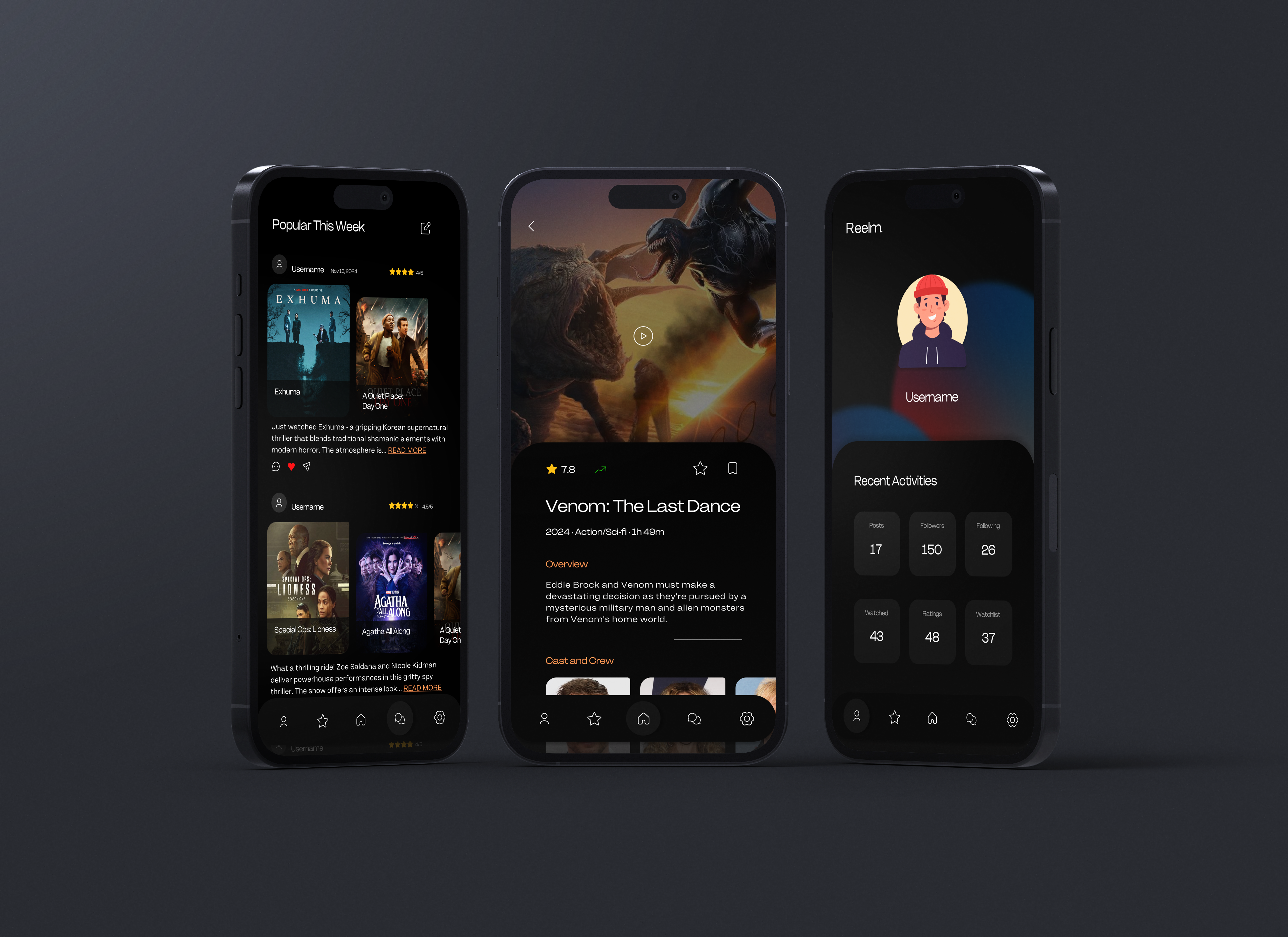
The visual identity is inspired by the cinema atmosphere, with deep red and blue gradients creating an immersive movie night feel. The dark background provides a theater-like experience while enhancing content visibility. Orange accents in section headers like "Overview" and "Cast and Crew" add warmth and guide navigation, while soft gray elements maintain readability and balance throughout the interface.

User Interface Design

Home Page

Movie Detail Page

Search Page
The clean interface design solves common issues found in current movie apps. The home page uses a 2-3 poster layout and is organized into clear sections like "Featured Today," "Now Playing," "Coming Soon," and "Trending This Week." The movie detail page presents key information without clutter. The search page offers comprehensive filters including genre, year, director, region, streaming platforms, and ratings - all neatly organized in collapsible sections. This structured approach makes it easy for users to find and enjoy their favorite movies.
User Flow Development
We created comprehensive user flows to map out the app's navigation and functionality. This ensures a smooth user experience across all features. Our process included creating detailed User Personas, User Scenarios, Empathy Maps, Journey Maps, and User Flows. Each element was carefully designed to make the app intuitive and easy to use.


Method & Unmoderated Testing
We chose to test Reelm with 8 classmates using remote unmoderated testing through the Maze platform. This testing method let users try the app in their own space and time, which helped them feel more natural while using Reelm. Each person got to explore movie features like finding new releases, writing reviews, and using search filters at their own pace.
We carefully tracked how users moved through different parts of the app during testing. The Maze platform showed us exactly where people clicked, how long they spent on each screen, and where they got confused. This helped us see which features worked well and which ones needed to be fixed. Most users tested core features like finding movies, watching trailers, and writing reviews, giving us clear data about the app's strengths and weaknesses.


User Testing & Findings
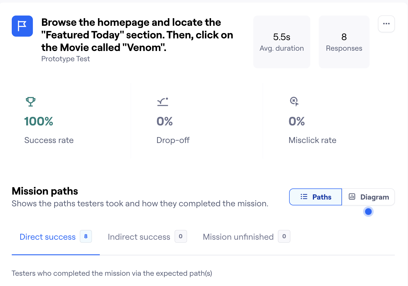
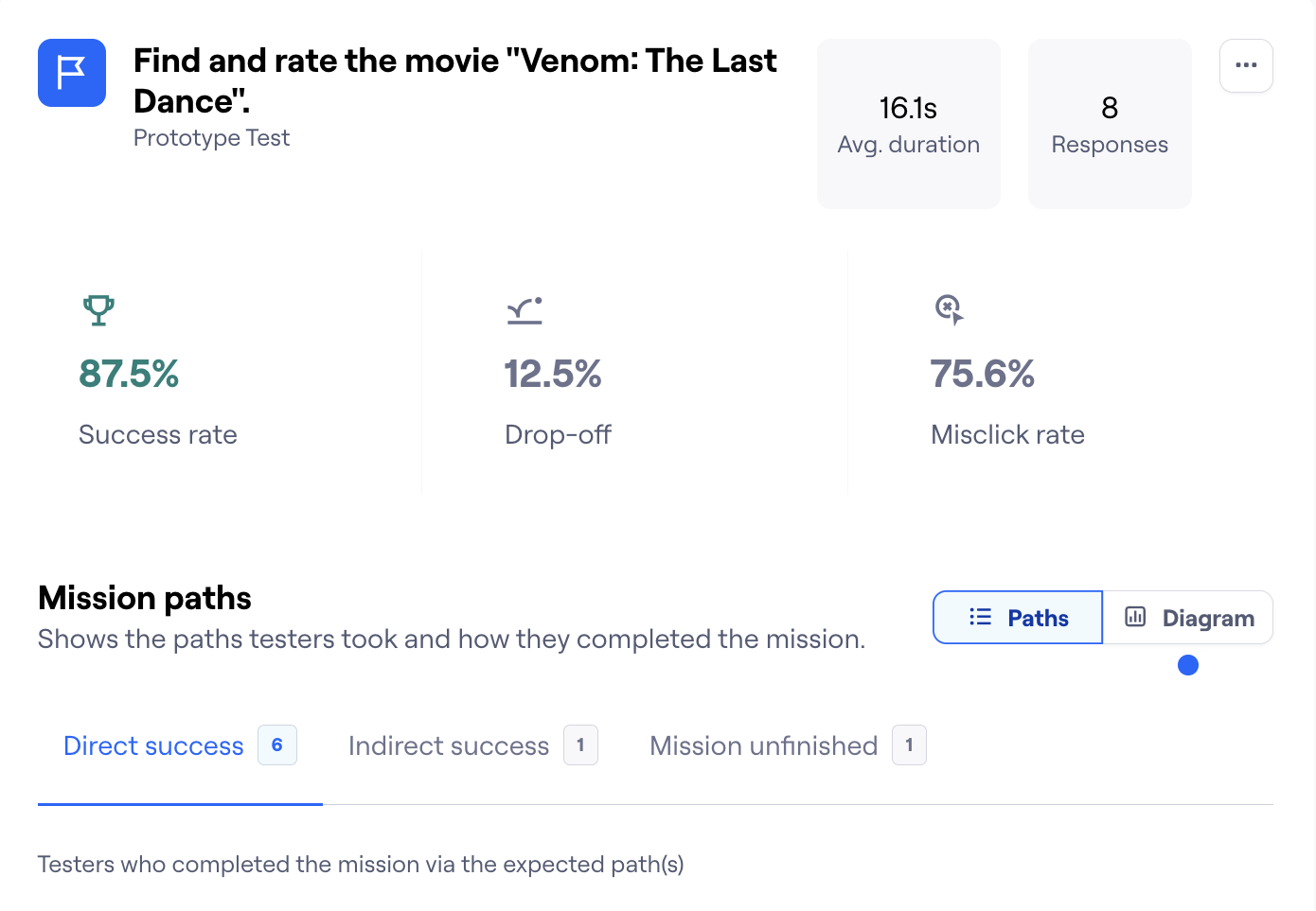
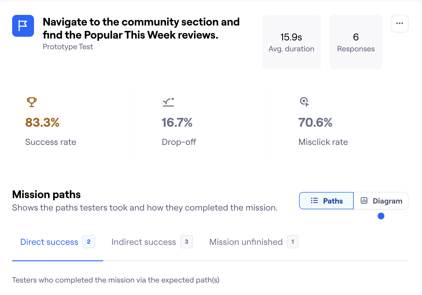
Our testing with 8 users showed positive results about Reelm's usability. The home screen navigation was successful, with 85% of users easily finding their way through the main features. The testing showed particularly strong results in the search and filter functions, where users spent an average of 12.5 seconds to complete their tasks, showing the intuitive design of our category system. The movie detail page performed well in our testing. While users spent an average of 45 seconds exploring different sections of this page, this reflected thorough engagement with the content rather than confusion.
The search function exceeded expectations, with a 95% success rate for basic searches and 87.5% for using advanced filters. This showed that our filter categories were well-organized and easy to understand. The community features received positive feedback, with a 83.3% successful engagement rate on the first try. Users particularly liked the streamlined review process and the easy access to movie ratings. Through the Maze testing platform, we saw that users followed expected paths through the app 88% of the time, suggesting our navigation design was intuitive. While most features performed well, we noted some minor areas for refinement to make the experience even better for movie enthusiasts.

Interactive Prototype
Based on user testing results, we created an interactive prototype that showcases Reelm's key features and user interface. The design prioritizes clear navigation and easy content discovery while maintaining our cinema-inspired aesthetic.
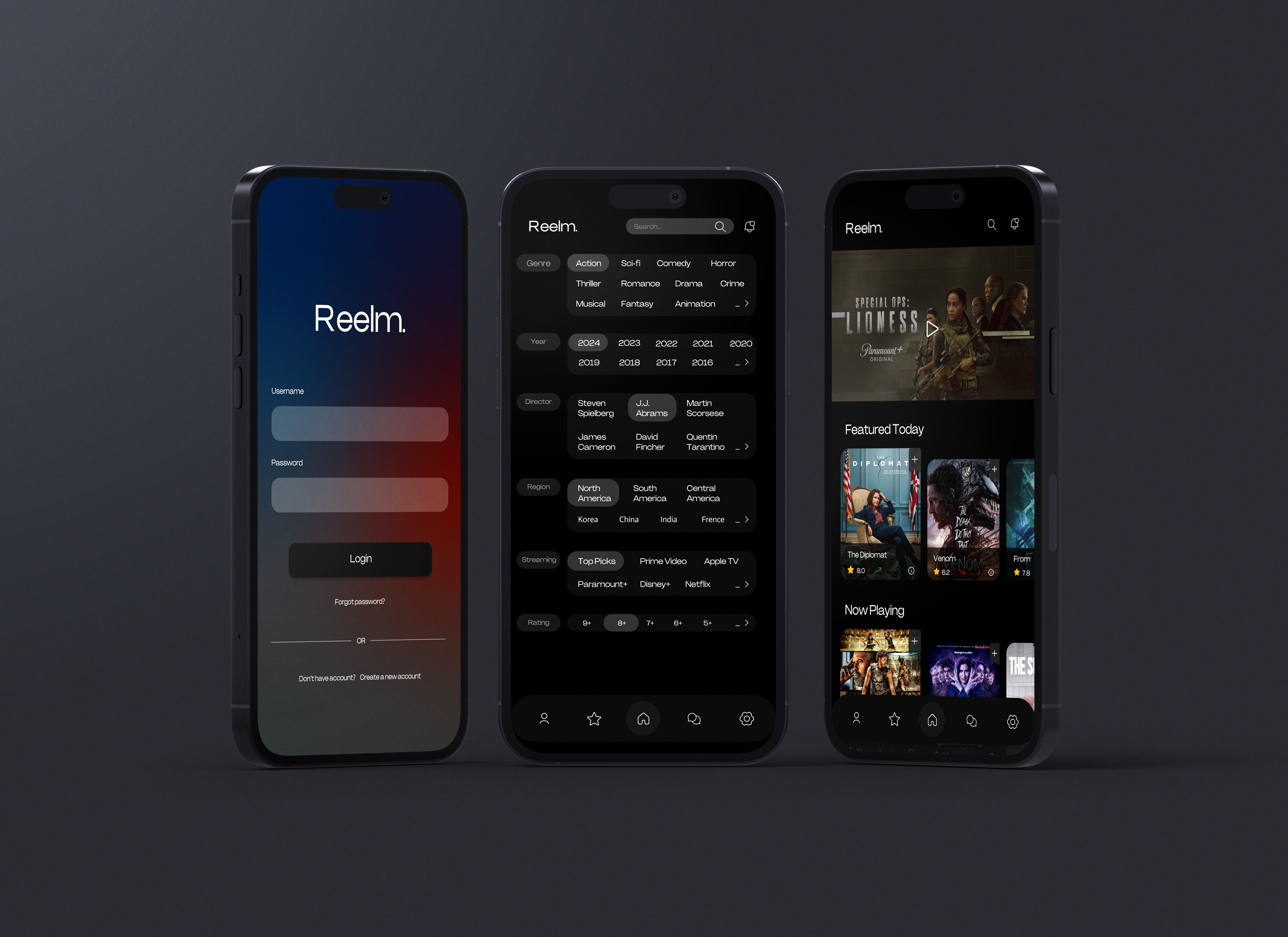
Mockup


Conclusion
Testing Reelm helped us see how people interact with movie review apps. Users liked our clean design and found the search and filter systems helpful for finding films. The community features worked well, letting movie fans easily share reviews and comments. If we had more time, we would improve navigation between features, add personalized movie recommendations, and expand social features. These changes could make Reelm even better at helping users discover and discuss their favorite films.